RAK Digital is the central portal for digital services of the Ras Al Khaimah government, used by residents and businesses

My role
Lead Product Designer. I owned the navigation restructure, the visual alignment with the wider RAK government brand, and the design of the AI-assisted service discovery, plus design review for the team and presentation of decisions to the client.
The problem
RAK Digital is the digital services arm of the Ras Al Khaimah government. The portal hosts a large number of services – for both residents and businesses – across many government departments.
Two problems came in together:
- Visual misalignment. The portal needed to look and feel like part of the wider RAK government ecosystem, in line with the main government site. The existing visual language had drifted from that standard.
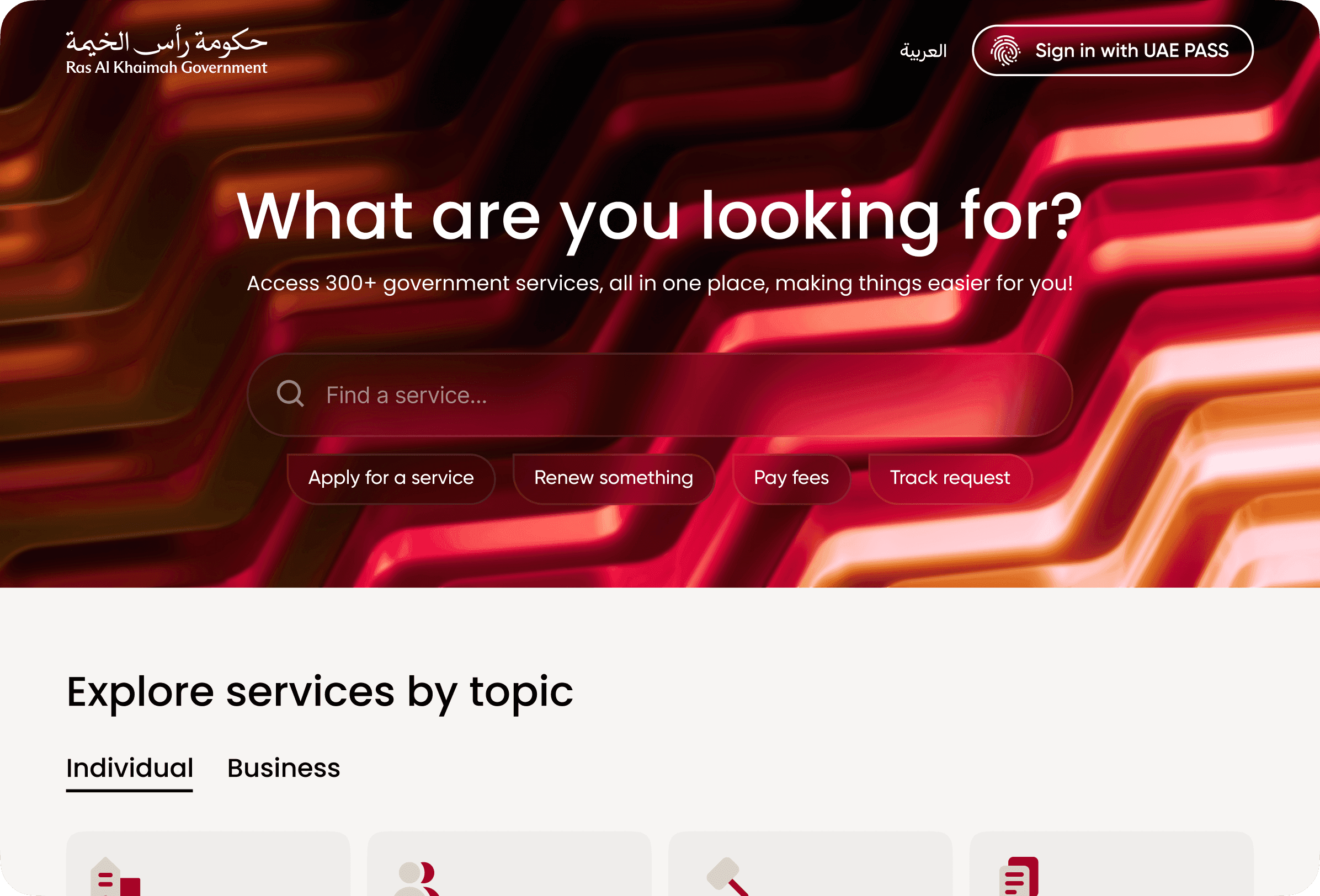
- Buried services. The bigger problem was structural. There were a lot of services, but the way they were organised didn't help anyone find them. Reaching a service page and starting an application typically took 6–7 clicks – too many for a portal whose entire job is to get people to the service.
The core of this case is the second one: how to take a sprawling catalogue of government services and make any of them reachable in a few clicks, without flattening the structure into chaos.
Research
The first step was an honest map of what was actually there:
- a full inventory of services, the departments that own them, and the audiences they serve (residents vs. businesses, often both);
- the existing navigation paths and where users were dropping off;
- how the wider RAK government brand handles structure and visual hierarchy on its main properties – the portal had to fit into that family;
- patterns from other government and large-catalogue portals to see how they handle the "hundreds of services across many departments" problem.
The takeaway was that the existing structure was trying to be a complete taxonomy of government services. That's accurate but not useful: most users don't think in terms of "which department owns this" – they think in terms of "I need to do this thing."
Hypotheses
- If we introduce themes – preset filters that group services around real-life jobs ("starting a business," "residency," "vehicles," etc.) – users will reach the right service much faster than by drilling through department trees.
- If we keep department-based navigation as a parallel filter, business and professional users who already know which department they need won't lose the direct path.
- If we add a chat-style AI assistant for service discovery, users with unclear or ambiguous needs will get to the right service faster than through any static structure.
Concepts
The navigation restructure had two parallel layers:
- Themes as the primary entry. A small set of high-level themes built around what people actually come to a government portal to do. Each theme expands into preset categories and subcategories. This is the layer most users will use.
- Departments as a secondary filter. Kept for users – usually business-side – who already know which department they need and want to go straight there.
On top of that, an AI chat assistant sits as a third path. Users describe what they need in their own words; the assistant routes them to the right service. It's not a replacement for navigation – it's a faster lane for cases where the user can't easily map their need onto any taxonomy.
The visual side was a parallel track: aligning typography, colour, components, and layout language with the wider RAK government brand so the portal feels like one piece of the broader government experience, not a side product.
Final solution
The portal launched with three coherent ways to find a service:
- Themes group services around recognisable jobs to be done, with preset categories and subcategories underneath.
- Department filters run alongside themes – for users who prefer to navigate by structure.
- An AI assistant covers free-text discovery when the user isn't sure where to start.
Underneath the navigation, the visual language was rebuilt to match the wider RAK government brand – consistent typography, colour, and component patterns – so RAK Digital reads as part of the same family as the main government site.
Outcome
- The number of clicks from the homepage to a service application dropped from 7 to 3 for the typical path through themes.
- The portal now sits visually inside the wider RAK government brand family, instead of looking like a separate product.
- The AI assistant became a new discovery pattern alongside the catalogue, useful for cases where users don't know how to phrase their need in government taxonomy.