Skiply is a wallet that brings tuition and additional education payments into a single app

My role
Lead Product Designer. I owned strategic design and product direction decisions, design review for everything the design team produced, communication with the bank's product team on blockers and contested calls, usability testing and post-release product metrics together with the analyst, presenting design decisions to Rakbank C-level.
The problem
Skiply had been around for a while, but active development had stalled – Covid, layoffs, shifting priorities. Real work resumed in 2025, and I essentially walked into a fresh project, just with a live app on the store and a backlog of negative reviews.
There wasn't a single up-to-date input metric to anchor our decisions. What was clear: nothing on the UAE market combined tuition, extracurriculars, and financial literacy under one roof. At the time of the relaunch, there were no direct competitors in the country.
On top of that, we inherited legacy branding made before us. We had to ship MVP with it, then rebuild the visual language after release to fit the actual product scenarios.
Research
With no fresh input data, I had to build research from scratch.
What I did:
- mapped out how tuition and extracurricular payments work in the UAE today from a parent's perspective: bank transfers, scattered payment links, paying at the school's reception;
- pulled references from modern fintech products – Wise, Revolut, and others. Went through flows on Mobbin to see how registration, KYC, payments, and service management are solved today;
- went through the existing app's reviews from 2022–2023: the main complaints were about disjointed functionality, scattered scenarios, and a general sense that the product was assembled from unrelated pieces;
- looked at what the bank already knew about its customer base: families with children, card activity in the Education category;
- went through the legacy branding. Decided what stays, what gets in the way, what definitely won't survive scaling.
Two adjacent products – Wio and Leap – appeared on the market while we were working on the project. I went through both, but didn't treat them as direct competitors – at most, as indirect ones. Both are family wallets focused on savings and parental controls over kids' spending, without tools for paying for school or education.
Key takeaways:
- A family is not a single user. The parent makes the decisions, but both parent and child use the interface. The two roles need different scenarios and different access levels.
- Education payments aren't one-off transactions, more like a subscription. They follow a recurring rhythm – month, semester, year. The product should remember that rhythm so the user doesn't have to.
- Registration in a UAE banking product is its own pain point because of KYC. Any extra friction here costs conversion directly.
Hypotheses
From these takeaways, I framed three working hypotheses for MVP:
- If we split the interface into two roles (parent/child) with different scenarios, parents will see the product as a control tool and kids will see it as their own finance tool. That should give better retention than a "regular" banking app under a single login.
- If we pull all education payments into one entity with a clear payment schedule, parents will open the app not just to pay, but regularly – to see what's coming up.
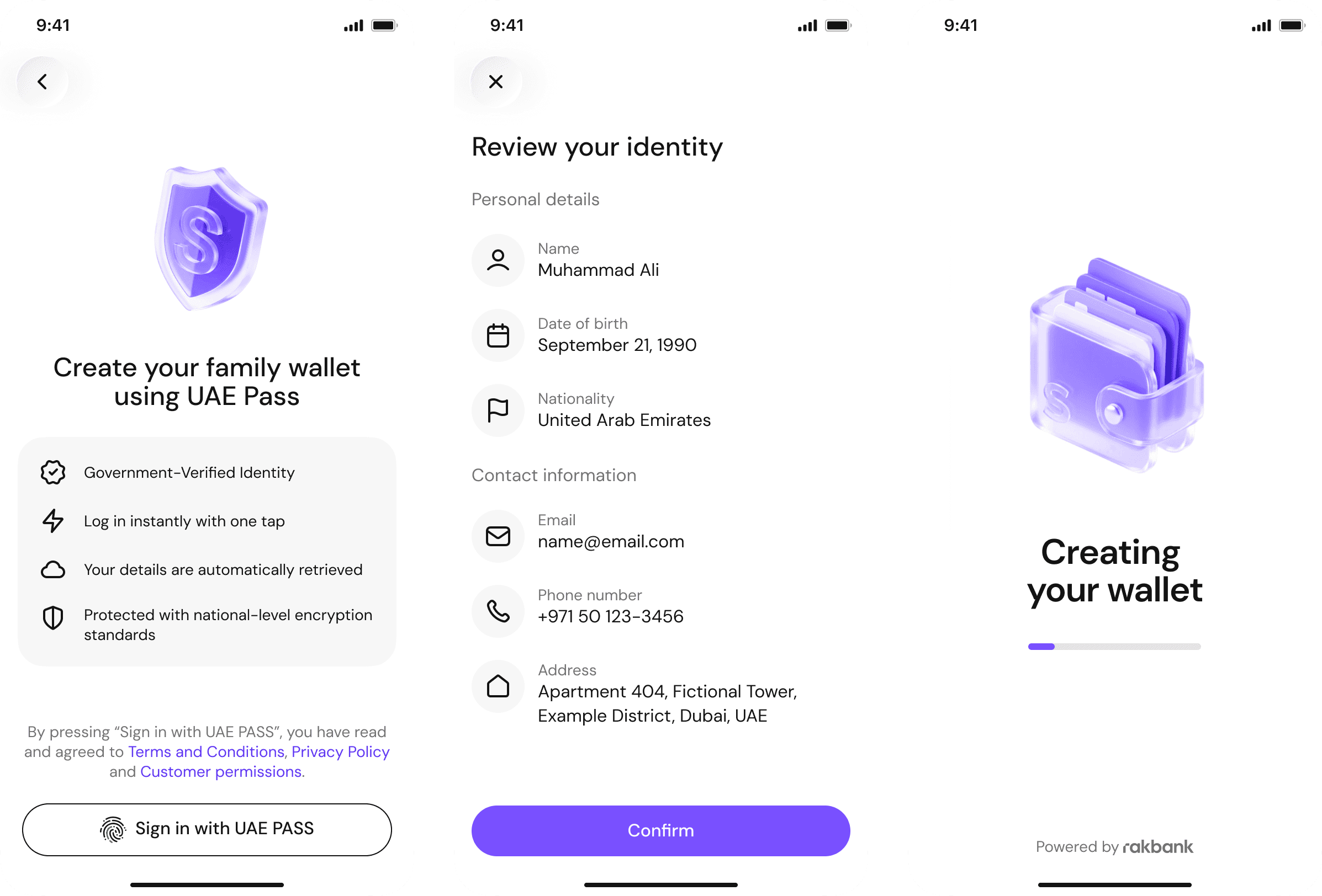
- If we shorten registration to the minimum KYC requires, activation conversion will go up. The flow we got from the bank was 32 screens. I went through it and saw that a significant share of steps either duplicated data (the card linked to the wallet, for example, re-collected fields already entered when opening the wallet) or could move to background processing without blocking the user – manual compliance checks, account opening status, optional documents.
Concepts
For each hypothesis, the team produced 2–3 concepts. The most illustrative one is registration.
The original flow from the bank was 32 screens. Inside: KYC via UAE Pass and Emirates ID, optional collection of additional documents and manual verification, plus a separate long block for issuing the card with re-entry of the same data. Each step was its own screen with a Next button.
I broke down the flow and rebuilt it on a different principle: anything that blocks the user for compliance reasons stays synchronous; anything the bank needs to collect or verify on its side moves to the background with status visible inside the app; anything duplicated gets removed.
I worked through two options:
-
Only UAE Pass and Emirates ID stay synchronous. The card is issued automatically using the same data as the wallet, with no re-entry. Optional documents and manual verification move to a separate scenario inside the app that doesn't block the first session. Strongest on conversion but risky: if verification requires manual review, the user lands in an app with limited functionality, and the "what's available now, what isn't yet" states have to be handled very carefully.
-
Synchronous steps are UAE Pass, Emirates ID, and a short product intro with adding the first child. Card issuance runs in parallel without re-collecting data. Manual checks and optional documents run in the background with application status visible in the app – the user sees where their account stands and can explore the product while the bank does its part on their side.
Together with the product owner and compliance, we went with option 2. The final flow came out to 12 screens instead of 32.
Testing
I ran the usability testing process, but the bank's product team ran the actual sessions – respondents were Arabic-speaking, and without an interpreter I couldn't run them on my own. I prepared scenarios, framed the hypotheses I wanted to check, and went through the results together with the product owner and the analyst.
We ran two rounds:
- before MVP release – registration and the main scenario of paying school tuition for a semester, around 10 parents from the target audience;
- after release – targeted feedback from early users, cross-checked against the funnel.
Children weren't invited to testing – the child role was validated through internal review with the product owner and my designers.
What changed as a result:
- on the payment confirmation screen, I added a block with the schedule of upcoming payments – parents don't remember the dates themselves and want to see them right after paying;
- I pulled all compliance consents onto a single screen with collapsible blocks – before that there were three separate screens with long text, and a steady share of users dropped off on them;
- I reworked the app's states for users whose account is opened but still under manual review – testing showed that people couldn't tell what was already available to them and what wasn't yet.
Final solution
After MVP, the second wave kicked in. I worked on three things here.
First, I built the design system. Skiply is a Rakbank sub-brand, and its design system couldn't live a separate life: the bank has its own system, and a portion of the dependencies had to be reused. I built Skiply's system so it would sit on top of Rakbank's system principles – with shared tokens where it made sense, and its own visual language where Skiply needed to sound like a distinct product. On the level of tokens, components, and documentation, this gave a clear model: development didn't get confused about which component to pull from where, and changes to the bank's system propagated to Skiply predictably.
Second, I rebuilt the brand language. The legacy branding stretched poorly to new scenarios, especially the child interface and financial visualisation (budget charts, payment schedules). I wrote guidelines for both roles: the parent side stricter and calmer, the child side warmer with playful elements, all within one consistent language and respecting the boundaries set by the Rakbank brand.
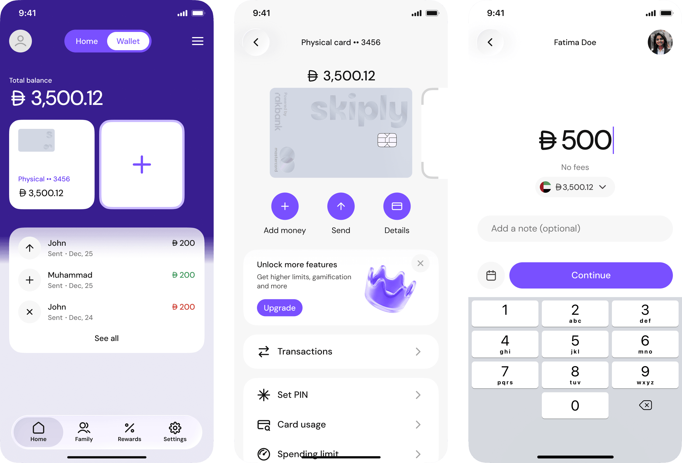
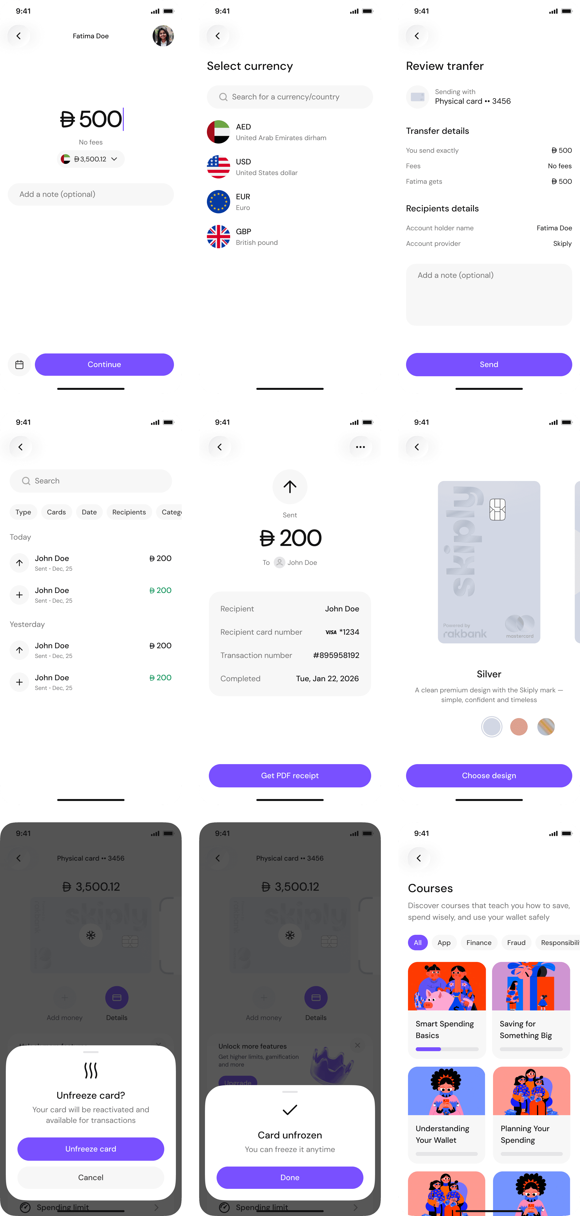
Third, I designed all the main flows: registration, school payments, club payments, adding a child, budget allocation, parental controls, child wallet, transfers between family members.
I presented all key decisions to Rakbank C-level. That was a separate layer of work – at that level, the conversation wasn't about visuals but about how design decisions would affect the bank's product strategy.
Outcome
- Registration shrank from 32 screens to 12 – the solution passed compliance and shipped to production.
- The app currently has over 10,000 ratings and a 4.8 average on the App Store. That's especially telling against the 2022–2023 reviews, where the main complaint was disjointed functionality: after the relaunch, the rating went up significantly, and the tone of the reviews themselves changed.
- The design system handled scaling and integrated with Rakbank's system at the level of shared dependencies. The team started assembling new flows and features from ready-made blocks instead of drawing from scratch. This later sped up the merchant side too, which was built on top of the same system.
- The new brand language survived scaling and became the foundation for marketing materials and the second app for schools.
- The app passed final review with Rakbank C-level.
- Other product metrics (activation conversion, MAU, recurring payments) were tracked by the bank's analyst after release. Under our agreement with Rakbank, I can't share the numbers publicly – happy to discuss the details in an interview.