Skiply Portal is the merchant side of Skiply for schools and education centres

My role
Lead Product Designer. I owned strategic design and product direction for the merchant platform, design review for everything my designers produced, plus final handoff to development, communication with the bank's product team on contested calls, and presenting design decisions to Rakbank stakeholders.
The problem
The Skiply consumer app is only one half of the product. Without the merchant side, there's nothing to pay for: schools and education centres need a place to list their offers, define who they're aimed at, and process the actual payments. Skiply Portal is that side – a web platform for schools and additional education providers.
The pain on the merchant side was structural. Schools in the UAE largely run education payments through manual invoices, scattered payment links, or front-desk collection. There was no single tool that would let them list a tuition package or a club, define an audience for it, and accept payments through the same channel a parent already uses for everything else.
The challenge was twofold: build a platform that schools – usually staffed by people with no product or admin-panel background – could actually use day to day, and keep it tightly aligned with the consumer app so a single offer flows through both sides cleanly.
Research
I went through three layers before any concepts:
- how schools and education centres in the UAE currently manage education payments – invoices, manual collection at the front desk, ad-hoc payment links, separate spreadsheets for student lists and audiences;
- admin and merchant panels in adjacent categories – e-commerce back offices, education platforms, marketplaces – to understand which patterns scale to non-technical users and which only work for tech-savvy teams;
- the consumer-side data model from Skiply – what an "offer" looks like to a parent, how audiences are matched, how payments flow – so the merchant model would map to it without translation layers.
Key takeaways:
- The primary user on the merchant side isn't a product person or an admin – it's a school employee whose main job isn't running software. The interface has to absorb that. Patterns that look obvious to a B2B SaaS audience are not safe defaults here.
- The merchant data model has to mirror the consumer one. If "audience" means one thing to a parent and another thing to a school, the marketplace breaks.
- There's a recurring rhythm on the merchant side too – semesters, intakes, club seasons. The platform has to make those cycles cheap to manage, not just possible.
Hypotheses
- If we collapse the merchant workflow into a few clear modules – offers, audiences, payments, analytics – instead of replicating the bank's internal admin structure, schools will be able to run the platform without dedicated training.
- If the audience model on the merchant side is the same shape as on the consumer side, offers will reach the right families without manual reconciliation, and the support load on the bank's team will stay manageable as the merchant base grows.
- If we reuse Skiply's design system and adapt it to a desktop admin context, both products will feel like one ecosystem and we'll avoid maintaining two visual languages in parallel.
Concepts
The structure of the portal was the most important call. The bank's initial expectation was something close to a traditional banking back office – heavy on settings, verification screens, and admin trees.
I pushed for a different shape: a small set of merchant-facing modules built around the actual jobs schools do – list an offer, define who can see it, accept payments, see how things are going. Bank-side processes (verification, compliance, settlements) stay in the platform but live in their own area, separate from day-to-day work.
The core modules ended up as:
- Offers – listing tuition packages, clubs, equipment, and one-off services, with the same data model the consumer app consumes.
- Audiences – defining who an offer is for, mirroring the audience matching on the family side.
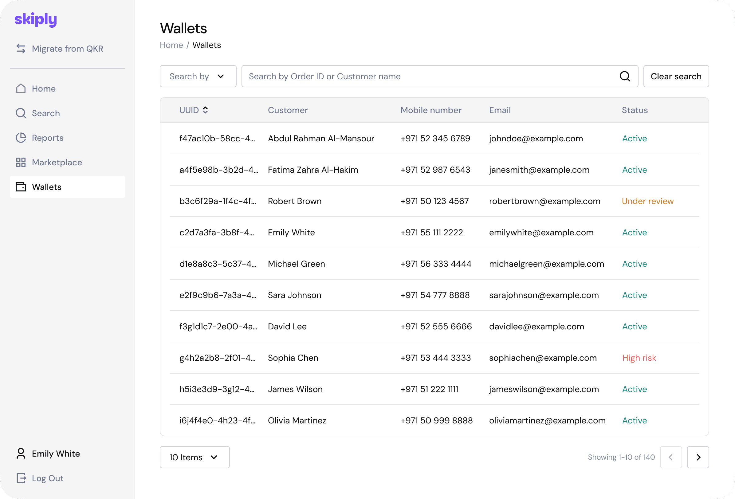
- Payments – managing incoming payments, settlements, and reconciliation.
- Analytics – basic visibility into what's selling, who's paying, and what's lapsing.
Final solution
The portal shipped as a desktop-first web application built on the same design system as the consumer app, with a separate set of components specific to admin contexts (data tables, complex forms, multi-step workflows).
Three things mattered most in the final solution.
First, the design system. Tokens, typography, and core components are shared with the Skiply app. Where the desktop admin needed its own patterns – dense tables, side-by-side editors, bulk operations – I extended the system instead of forking it.
Second, workflows over screens. I built each merchant job – publishing an offer, setting up a new intake, reviewing payments – as a workflow with clear states, not as a sequence of disconnected forms.
Third, safe defaults for non-technical users. Sensible presets, clear empty states, inline explanations on the screens schools actually open every day, and a deliberate reduction of options where they didn't earn their keep.
I presented key design decisions to Rakbank stakeholders alongside the consumer-side work, framing the portal as the other half of the same product rather than a separate project.
Outcome
- The merchant platform launched as the second half of the Skiply ecosystem, giving schools a self-service way to list offers, define audiences, and run payments.
- Both products run on a shared design system, which made the merchant side ship faster and kept the visual language consistent across the family app and the merchant portal.
- The platform became the foundation for the merchant brand and the marketing materials around the school-facing side of Skiply.
- Specific merchant metrics – onboarded schools, listings, payment volume – are tracked on the bank's side. Under our agreement with Rakbank, I can't share the numbers publicly – happy to discuss the details in an interview.